9.xarray繪圖 (2):繪製2D資料#
全球或跨越180經度線的區域地圖#
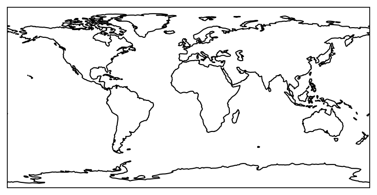
雖然在前面已經介紹過cartopy的用法,但由於cartopy繪製全球地圖時,中線預設為0度,原則上繪圖的範圍必須限縮在-180至180度 (詳細可以參考StackOverflow的說明)。因此在不額外設定其他參數的話,繪製出的全球地圖如以下範例所示:
import matplotlib as mpl
from matplotlib import pyplot as plt
from cartopy import crs as ccrs
from cartopy.mpl.gridliner import LONGITUDE_FORMATTER, LATITUDE_FORMATTER

mpl.rcParams['figure.dpi'] = 150

fig, ax = plt.subplots(1,1,subplot_kw={'projection':ccrs.PlateCarree()})
ax.set_global()
ax.coastlines()
<cartopy.mpl.feature_artist.FeatureArtist at 0x7fa8502e46d0>
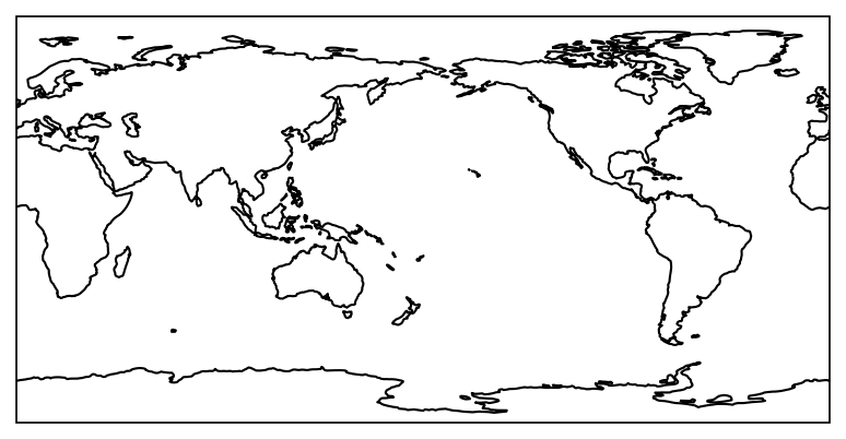
如果繪製地圖的範圍要橫跨180度,需要在投影設定中加上central_longitude=180。
fig, ax = plt.subplots(1,1,subplot_kw={'projection':ccrs.PlateCarree(central_longitude=180)})
ax.set_global()
ax.coastlines()
<cartopy.mpl.feature_artist.FeatureArtist at 0x7fa6091a2590>
區域地圖繪製還需要額外步驟。假設現在要繪製的地圖經緯度範圍為(20˚S-30˚N, 40˚E-150˚W),在 繪圖空間 ax上,要指定投影方式projection=ccrs.PlateCarree(central_longitude=180)。
ax.set_extent中crs引數為坐標系統,不需要再給定central_longitude=180,否則坐標投影會轉換兩次。同理,資料的transform引數也要設定為projection=ccrs.PlateCarree(),不需要再指定central_longitude=180。
import xarray as xr
import numpy as np
import cmaps
from cartopy.mpl.ticker import LongitudeFormatter, LatitudeFormatter

def smthClmDay(clmDay, nHarm):
    from scipy.fft import rfft, irfft
    nt, ny, nx = clmDay.shape
    cf = rfft(clmDay.values, axis=0)     # xarray.DataArray.values: convert to numpy.ndarray first.
    cf[nHarm,:,:] = 0.5*cf[nHarm,:,:]    # mini-taper.
    cf[nHarm+1:,:,:] = 0.0               # set all higher coef to 0.0
    icf = irfft(cf, n=nt, axis=0)       # reconstructed series
    clmDaySmth = clmDay.copy(data=icf, deep=False)
    return(clmDaySmth)

lats, latn = -20, 30
lon1, lon2 =  40, 210
time1 = '2017-12-01'
time2 = '2017-12-31'

olr_ds = xr.open_dataset("data/olr.nc")
olrrt = (olr_ds.sel(time=slice(time1,time2),
                    lat=slice(lats,latn),
                    lon=slice(lon1,lon2)).olr)
olrlt = (olr_ds.sel(time=slice('1998-01-01','2016-12-31'),
                    lat=slice(lats,latn),
                    lon=slice(lon1,lon2)).olr)

olrDayClim = olrlt.groupby('time.dayofyear').mean('time')
olrDayClim_sm = smthClmDay(olrDayClim,3)
olra = olrrt.groupby('time.dayofyear') - olrDayClim_sm
olram = olra.mean(axis=0)

fig, ax = plt.subplots(1,1,subplot_kw={'projection':ccrs.PlateCarree(central_longitude=180)})

plot = olram.plot.contourf("lon", "lat", ax=ax,
                           levels=[-72,-60,-48,-36,-24,-12,0,12,24,36,48,60,72],
                           cmap=cmaps.sunshine_diff_12lev,
                           add_colorbar=True,
                           transform=ccrs.PlateCarree(),  # Data's projection.
                           cbar_kwargs={'orientation': 'horizontal', 'aspect': 30, 'shrink': 0.8, 'label': r"[W m$^{-2}$]"})

ax.set_extent([lon1, lon2, lats, latn], crs=ccrs.PlateCarree())
ax.coastlines()
ax.set_xticks(np.arange(60,240,30),crs=ccrs.PlateCarree())
ax.set_xticks(np.arange(60,220,10),minor=True,crs=ccrs.PlateCarree())
lon_formatter = LongitudeFormatter(zero_direction_label=True)
lat_formatter = LatitudeFormatter()
ax.xaxis.set_major_formatter(lon_formatter)
ax.yaxis.set_major_formatter(lat_formatter)
ax.set_yticks(np.arange(-20,40,10),crs=ccrs.PlateCarree())
ax.set_yticks(np.arange(-20,35,5),crs=ccrs.PlateCarree(),minor=True)
ax.set_xlabel(' ')
ax.set_ylabel(' ')

plt.show()
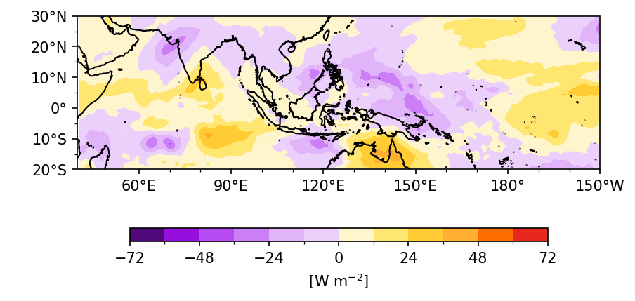
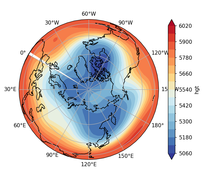
因此用Python繪圖有一個很重要的概念,就是繪圖空間ax有它自己的座標軸,資料本身也有自己的座標軸,兩者是不一樣的。因此在繪圖的transform引數中,就要告訴繪圖函數資料本身的座標軸為何,這樣才能根據資料和繪圖空間指定的座標軸進行座標轉換。在下一個範例中,我們將500-hPa高度場繪製在極投影地圖上,再說明一次這個觀念。
其他地圖投影#
在以上的範例中,我們使用了 ccrs.PlateCarree(),代表等距長方投影。Cartopy還提供了其他投影的方式,詳見Cartopy projection list。
Example 1: 繪製2017/12月平均500-hPa高度場的極投影 (利用ccrs.Orthographic)。
time1 = '2017-12-01'
time2 = '2017-12-31'

zds = xr.open_dataset('data/ncep_r2_h500.2017.nc')
z = zds.sel(time=slice(time1,time2),
            lat=slice(90,0),
            level=500).hgt
zm = z.mean(axis=0)

fig, ax = plt.subplots(1,1,subplot_kw={'projection':ccrs.Orthographic(central_longitude=120, central_latitude=90)})

# Plot settings
clev = range(5060,6080,60)
plot = zm.plot.contourf(levels=clev,ax=ax,
                        cmap=cmaps.cmp_b2r, extend='both',
                        transform=ccrs.PlateCarree())
ax.coastlines()
ax.gridlines(draw_labels=True,
             xlocs=np.arange(-180,240,30))
ax.set_title(' ')

plt.show()
上面的作法必須畫整個半球,如果只想畫特定緯度範圍 (例如:20˚-90˚N),可以參考下面的作法,是利用ccrs.NorthPolarStereo(),但處理邊界的問題較為複雜。
import matplotlib.path as mpath

z = zds.sel(time=slice(time1,time2),
            lat=slice(90,20),
            level=500).hgt
zm = z.mean(axis=0)

# Plot settings
fig, ax = plt.subplots(1,1,subplot_kw={'projection':ccrs.NorthPolarStereo(central_longitude=120)})
clev = range(5060,6080,60)
plot = zm.plot.contourf(levels=clev,ax=ax,
                        cmap=cmaps.cmp_b2r, extend='both',
                        transform=ccrs.PlateCarree())
ax.set_extent([0, 360, 20, 90], ccrs.PlateCarree())
# Compute a circle in axes coordinates, which we can use as a boundary
# for the map. We can pan/zoom as much as we like - the boundary will be
# permanently circular.
theta = np.linspace(0, 2*np.pi, 100)
center, radius = [0.5, 0.5], 0.5
verts = np.vstack([np.sin(theta), np.cos(theta)]).T
circle = mpath.Path(verts * radius + center)

ax.set_boundary(circle, transform=ax.transAxes)
ax.coastlines()
gl = ax.gridlines(draw_labels=True,
                  xlocs=np.arange(-180,240,60))
gl.ylabels_right = False

plt.show()
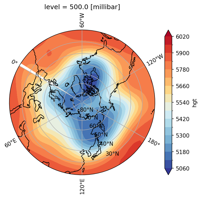
再說明一次,在繪製zm的函數中有兩個地方給定了投影方法,一個是subplot_kws (繪圖空間的keyword argument),一個是transform引數,這是因為在Python的繪圖邏輯中,繪圖空間ax的座標軸和資料本身的座標軸是不一樣的,因此必須要分開給定並且用transform引數做轉換。zm資料是正交方格,解析度是固定的,因此設定資料的座標是transform=ccrs.PlateCarree();而繪圖空間是極投影,所以設定subplot_kws=dict(projection=proj)。如此一來,Python就知道如何將資料轉換成適當的座標上。
繪製Hovmöller Diagram#
設定y軸為時間、x軸為經度 (或x軸為時間、y軸為緯度),就可以繪製出Hovmöller diagram。若y軸時間演進的順序要改為由上到下,則在繪圖時加入yincrease=False。
Example 2: 繪製2017年12月5˚S-5˚N平均的逐日Hovmöller diagram。
import pandas as pd

lats, latn = -5, 5

olrm = olrrt.sel(lat=slice(lats,latn)).mean("lat")
time = olrm.time

# Plot settings
fig, ax = plt.subplots(1,1,figsize=(4, 5)) # 不需要設定投影方法!

clevs = range(170,350,20)
hovm_plot = olrm.plot.contourf(x="lon", y="time",
                               ax=ax,
                               levels=clevs,
                               cmap='rainbow',
                               yincrease=False,                 # y axis be increasing from top to bottom
                               add_colorbar=True,
                               extend='both',                   # color bar 兩端向外延伸
                               cbar_kwargs={'orientation': 'horizontal', 'aspect': 30, 'label': r'[W m$^{-2}$]'})
ax.set_xlabel(' ')
ax.set_ylabel(' ')
ax.set_xticks(np.arange(60,240,60))
ax.set_xticks(np.arange(60,240,30),minor=True)
lon_formatter = LongitudeFormatter(zero_direction_label=True)
ax.xaxis.set_major_formatter(lon_formatter)
ax.set_yticks(time[0::5])
ax.set_title('OLR, 5˚S-5˚N',loc='left')
plt.show()
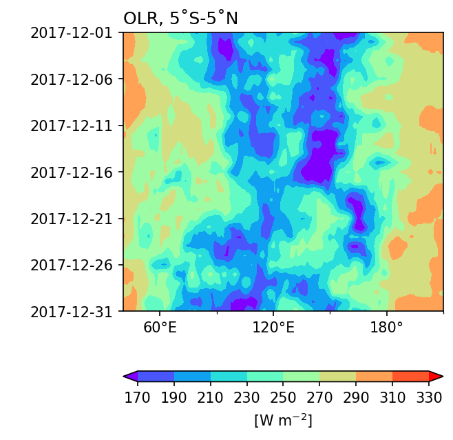
Note
Hovmöller Diagram 不需要用cartopy 畫地圖,所以跨越180度不需要特別的設定。
繪製等值線圖與疊圖#
繪製等值線圖使用的方法是xarray.DataArray.plot.contour(),和畫等值色圖的方法是一樣的。
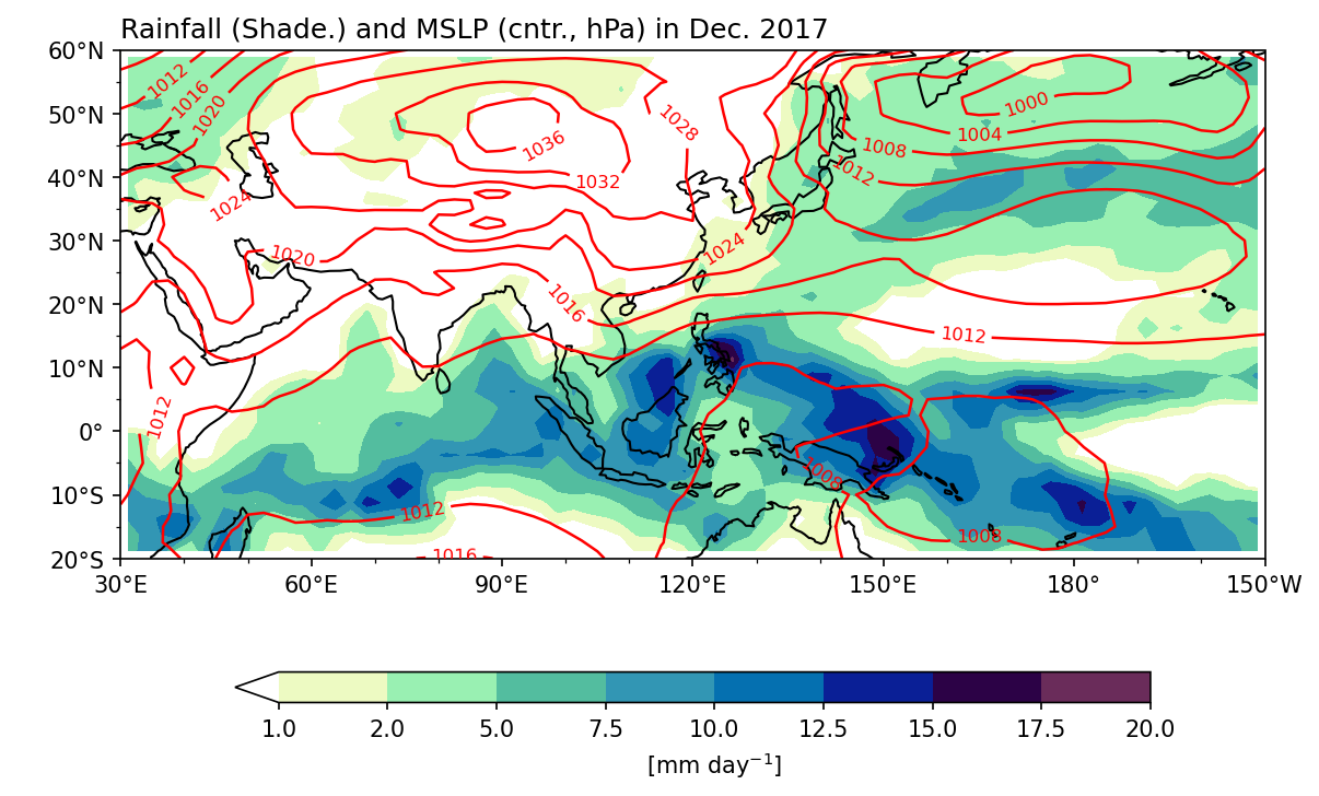
Example 3: 繪製2021年1月CMORPH降雨和MSLP的月平均,其中降雨以shading表示,MSLP以等值線表示。
Step 1: 準備資料。
lats = -20
latn =  60
lon1 =  30
lon2 = 210

pds = xr.open_dataset('data/gpcp_precip_1979-2019.pentad.nc')
pcp = pds.sel(time=slice('2017-12-01','2017-12-31'),
              lat=slice(latn,lats),
              lon=slice(lon1,lon2)).data
slp_ds = xr.open_dataset('data/mslp.2017.nc')
mslp = slp_ds.sel(time=slice('2017-12-01','2017-12-31'),
                  lat=slice(latn,lats),
                  lon=slice(lon1,lon2)).mslp

pcpm = pcp.mean(axis=0)
slpm = mslp.mean(axis=0)
slpm = slpm/100.
Step 2: 繪圖:若要將這兩種場量畫在同一張圖上,意味著兩張圖需要擁有共同的子圖ax,因此在繪圖方法函數中的ax引數中給定相同的子圖,就可以達到疊圖的目的。
fig, ax = plt.subplots(1,1,figsize=(9,6),
                       subplot_kw=dict(projection=ccrs.PlateCarree(central_longitude=180)))

clev = [1,2,5,7.5,10,12.5,15,17.5,20]
cf = pcpm.plot.contourf("lon", "lat", ax=ax,
                           levels=clev,
                           cmap=cmaps.precip_11lev,
                           add_colorbar=True,
                           transform=ccrs.PlateCarree(),
                           cbar_kwargs={'orientation': 'horizontal', 'aspect': 30, 'shrink': 0.8, 'label': r"[mm day$^{-1}$]"})
cl = slpm.plot.contour("lon", "lat", ax=ax,  # Same `ax` as `cf`!
                         levels=range(980,1048,4),
                         linewidths=1.2,
                         colors='red',
                         transform=ccrs.PlateCarree())

ax.clabel(cl, inline=True, fontsize=8)    # Set contour line labels.

ax.set_extent([lon1, lon2, lats, latn], crs=ccrs.PlateCarree())
ax.coastlines()
lon_formatter = LongitudeFormatter(zero_direction_label=True)
lat_formatter = LatitudeFormatter()
ax.xaxis.set_major_formatter(lon_formatter)
ax.yaxis.set_major_formatter(lat_formatter)
ax.set_xticks(np.arange(30,240,30),crs=ccrs.PlateCarree())
ax.set_xticks(np.arange(30,220,10),crs=ccrs.PlateCarree(),minor=True)
ax.set_yticks(np.arange(-20,70,10),crs=ccrs.PlateCarree())
ax.set_yticks(np.arange(-20,65,5),crs=ccrs.PlateCarree(),minor=True)
ax.set_xlabel(' ')
ax.set_ylabel(' ')

ax.set_title('Rainfall (Shade.) and MSLP (cntr., hPa) in Dec. 2017',loc='left')

plt.show()
繪製風場與疊圖#
風場屬於多變數資料(U、V),所以必須將這兩個變數合併成一個Dataset,才能使用xarray.Dataset.plot.quiver()的方法函數。而將兩個DataArray合併成一個Dataset,要利用xarray.merge()。
Example 4: 畫2017年12月OLR和850-hPa水平風場的月平均,其中OLR以等值色圖表示,風場以箭頭向量表示。
lats = -45
latn =  45
lon1 =  30
lon2 = 210

uds = xr.open_dataset('data/ncep_r2_uv850/u850.2017.nc')
vds = xr.open_dataset('data/ncep_r2_uv850/v850.2017.nc')
u = uds.sel(time=slice(time1,time2),
            lat=slice(latn,lats),
            lon=slice(lon1,lon2),
            level=850).uwnd
v = vds.sel(time=slice(time1,time2),
            lat=slice(latn,lats),
            lon=slice(lon1,lon2),
            level=850).vwnd
um = u.mean(axis=0)
vm = v.mean(axis=0)

wnd = xr.merge([um,vm])   # 將兩個DataArray合併成一個Dataset。
wnd
<xarray.Dataset> Size: 22kB
Dimensions:  (lon: 73, lat: 37)
Coordinates:
  * lon      (lon) float32 292B 30.0 32.5 35.0 37.5 ... 202.5 205.0 207.5 210.0
  * lat      (lat) float32 148B 45.0 42.5 40.0 37.5 ... -37.5 -40.0 -42.5 -45.0
    level    float32 4B 850.0
Data variables:
    uwnd     (lat, lon) float32 11kB 9.181 9.696 9.499 ... 4.067 4.576 5.064
vwnd (lat, lon) float32 11kB 2.825 4.076 4.622 ... 2.835 2.263 1.643我們先直接把風畫出來看看。
fig, ax = plt.subplots(1,1,figsize=(9,6),
                       subplot_kw=dict(projection=ccrs.PlateCarree(central_longitude=180)))
wind_plt = wnd.plot.quiver(ax=ax,
                           transform=ccrs.PlateCarree(),
                            x='lon', y='lat',
                            u='uwnd', v='vwnd',
                            width=0.0025 ,headaxislength=3,headlength=6,headwidth=7,
                            scale=200, colors="black",
                            )
ax.set_extent([lon1,lon2,lats,latn], crs=ccrs.PlateCarree())
ax.coastlines()
plt.show()
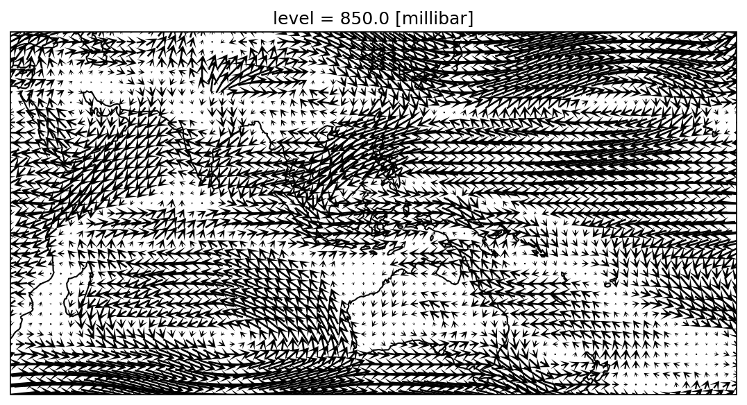
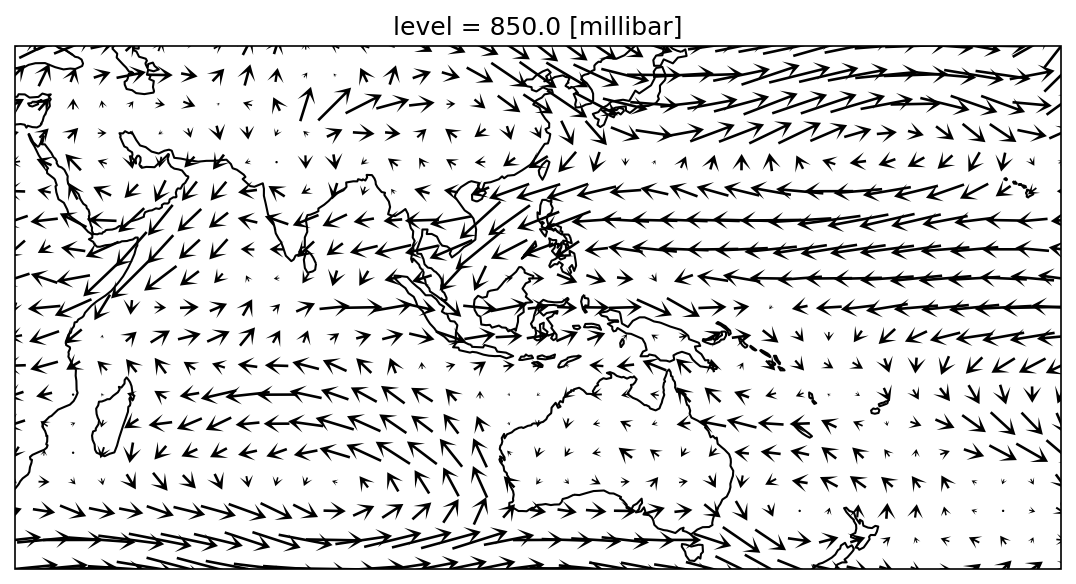
以上的圖,箭頭太密,都擠在一起。怎麼調整呢?風場可以每兩格經度和緯度選一次,這樣的話就只會畫在有選資料的網格上。
fig, ax = plt.subplots(1,1,figsize=(9,6),
                       subplot_kw=dict(projection=ccrs.PlateCarree(central_longitude=180)))

wnd = xr.merge([um[::2,::2],vm[::2,::2]])
wind_plt = wnd.plot.quiver(ax=ax,
                           transform=ccrs.PlateCarree(),
                            x='lon', y='lat',
                            u='uwnd', v='vwnd',
                            width=0.0025 ,headaxislength=3,headlength=6,headwidth=7,
                            scale=200, colors="black",
                            )
ax.set_extent([lon1,lon2,lats,latn], crs=ccrs.PlateCarree())
ax.coastlines()

plt.show()
如果跟OLR疊在一起看:
olr = olr_ds.sel(time=slice(time1,time2),
                 lat=slice(lats,latn),
                 lon=slice(lon1,lon2)).olr
olrm = olr.mean(axis=0)

fig, ax = plt.subplots(1,1,figsize=(9,6),
                       subplot_kw=dict(projection=ccrs.PlateCarree(central_longitude=180)))


olr_plot = olrm.plot.contourf("lon", "lat", ax=ax,
                               levels=range(170,350,20),
                               cmap='rainbow', add_colorbar=True,
                               transform=ccrs.PlateCarree(),
                               cbar_kwargs={'orientation': 'horizontal', 'aspect': 30, 'shrink': 0.8, 'label': r"[W m$^{-2}$]"})

wind_plt = wnd.plot.quiver(ax=ax,
                           transform=ccrs.PlateCarree(),
                            x='lon', y='lat',
                            u='uwnd', v='vwnd',
                            add_guide=False,
                            width=0.0025 ,headaxislength=3,headlength=6,headwidth=7,
                            scale=200, colors="black",
                            )
# 加上風標
qk = 10
qv_key = ax.quiverkey(wind_plt,0.94,1.03,10,r'10 m s$^{-1}$',labelpos='N', labelsep =0.05, color='black')

ax.set_extent([lon1,lon2,lats,latn], crs=ccrs.PlateCarree())
ax.coastlines()

ax.xaxis.set_major_formatter(lon_formatter)
ax.yaxis.set_major_formatter(lat_formatter)
ax.set_xticks(np.arange(30,240,30),crs=ccrs.PlateCarree())
ax.set_xticks(np.arange(30,220,10),crs=ccrs.PlateCarree(),minor=True)
ax.set_yticks(np.arange(-45,60,15),crs=ccrs.PlateCarree())
ax.set_yticks(np.arange(-45,50,5),crs=ccrs.PlateCarree(),minor=True)
ax.set_xlabel(' ')
ax.set_ylabel(' ')

ax.set_title(' ')
ax.set_title('OLR and 850-hPa wind, Dec. 2017', loc='left')

plt.show()
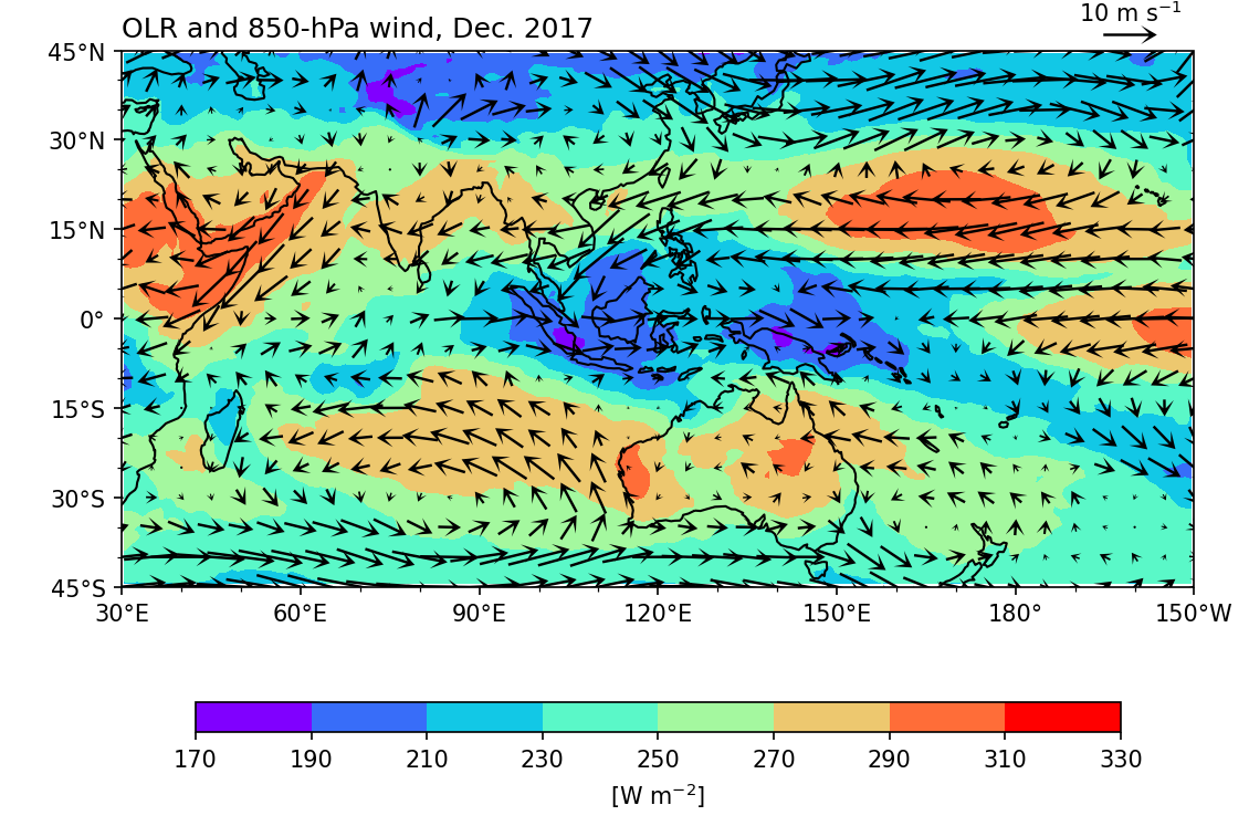
注意上圖olrm.plot.contourf()和wnd.plot.quiver()的ax引數都是ax=ax,表示這兩個圖共用一個子圖,所以可以將風場疊在OLR上。
加上風標可以使用ax.quiverkey()函數,用法是
(method) quiverkey: (Q: Quiver, X: float, Y: float, U: float, label: str, **kw: Any) -> QuiverKey
也就是在Q指定要畫哪一張圖的風標,然後給定繪製風標的位置,以及風標的參考數值。在wnd.plot.quiver()函數中加上add_guide=False,可以去除xarray Quiverplot預設的參考風標。
繪製流線場#
方法基本上跟畫風場一模一樣,只是將plot.quiver()改為plot.streamplot()。
wnd = xr.merge([um,vm])

plt.figure(figsize=[9,6])
fig, ax = plt.subplots(1,1,figsize=(9,6),
                       subplot_kw=dict(projection=ccrs.PlateCarree(central_longitude=180)))


olr_plot = olrm.plot.contourf("lon", "lat", ax=ax,
                               levels=range(170,350,20),
                               cmap='rainbow', add_colorbar=True,
                               transform=ccrs.PlateCarree(),
                               cbar_kwargs={'orientation': 'horizontal', 'aspect': 30, 'shrink': 0.8, 'label': r"[W m$^{-2}$]"})

wind_plt = wnd.plot.streamplot(ax=ax,
                              transform=ccrs.PlateCarree(),
                               x='lon', y='lat',
                               u='uwnd', v='vwnd',
                               arrowsize=2,arrowstyle='->',
                               color="black",
                               )

ax.set_extent([lon1,lon2,lats,latn], crs=ccrs.PlateCarree())
ax.coastlines()

ax.xaxis.set_major_formatter(lon_formatter)
ax.yaxis.set_major_formatter(lat_formatter)
ax.set_xticks(np.arange(30,240,30),crs=ccrs.PlateCarree())
ax.set_xticks(np.arange(30,220,10),crs=ccrs.PlateCarree(),minor=True)
ax.set_yticks(np.arange(-45,60,15),crs=ccrs.PlateCarree())
ax.set_yticks(np.arange(-45,50,5),crs=ccrs.PlateCarree(),minor=True)
ax.set_xlabel(' ')
ax.set_ylabel(' ')

ax.set_title(' ')
ax.set_title('OLR and 850-hPa wind, Dec. 2017', loc='left')

plt.show()
<Figure size 1350x900 with 0 Axes>
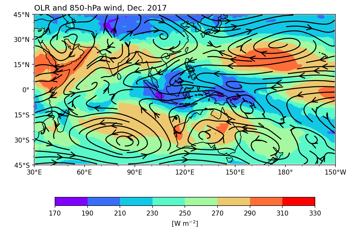
Caution
在 matplotlib.pyplot.streamplot 的說明裡有提到
x, y - 1D/2D arrays: Evenly spaced strictly increasing arrays to make a grid.
因此畫streamplot時必須要把資料整理成經度由西向東、緯度由南向北排列的順序。如果緯度軸顛倒過來了,可以加上da = da[:,::-1,:]來重新排列緯度軸的順序 (如果第1個axis是緯度時),其中::-1表示頭尾值相同,但間隔為-1。只有streamplot需要注意這點!
多格子圖 (Panel Plots/Facet Grid)#
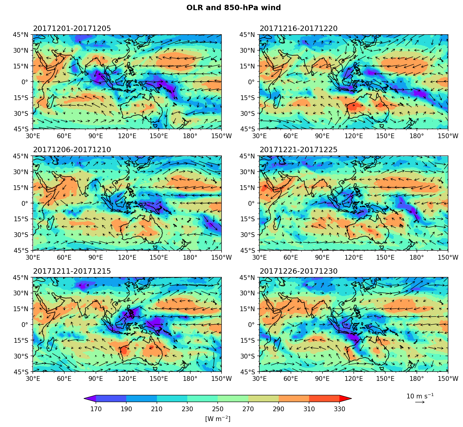
Example 5: 繪製2017年12月的候 (pentad) 平均OLR和850-hPa風場,畫成2欄 (columns) 3列 (rows) 共6個子圖,其中排列順序由上到下、再從左到右。
首先先將OLR和風場計算成候平均:
olr_pm = olr.coarsen(time=5,boundary='trim',coord_func='min').mean()
upm = u.coarsen(time=5,boundary='trim',coord_func='min').mean()
vpm = v.coarsen(time=5,boundary='trim',coord_func='min').mean()
wnd = xr.merge([upm[:,::3,::3],vpm[:,::3,::3]])
繪圖:我們生成一個包含6個子圖 (axes) 的畫布 fig,其中子圖有3列、2欄。我們將axes展開 (flatten),來控制每個子圖的內容。
其中xarray畫圖的順序和我們所期望的順序不太一樣,
xarray畫圖順序:                      期望的順序:
|   0   |   1   |                   |  0  |  3  |
|   2   |   3   |                   |  1  |  4  |
|   4   |   5   |                   |  2  |  5  |
所以配合xarray畫圖順序,我們加上 porder 來控制繪圖順序。
porder = [0,2,4,1,3,5] # To determine the plot order at each pentad.
fig, axes = plt.subplots(3,2,figsize=(12,10),
                        subplot_kw={'projection': ccrs.PlateCarree(central_longitude=180)})
ax = axes.flatten()

clev = range(170,350,20)

for i in range(0,6):
    cf = olr_pm[i,:,:].plot.contourf('lon','lat',
                                     ax=ax[porder[i]],
                                     levels=clev,
                                     cmap='rainbow', add_colorbar=False,
                                     extend='both',
                                     transform=ccrs.PlateCarree())
    qv = wnd.isel(time=i).plot.quiver(ax=ax[porder[i]],
                                      transform=ccrs.PlateCarree(),
                                      x='lon', y='lat',
                                      u='uwnd', v='vwnd',
                                      add_guide=False,
                                      width=0.0025 ,headaxislength=3,headlength=6,headwidth=7,
                                      scale=200, colors="black"
                                      )
    ax[porder[i]].coastlines()
    ax[porder[i]].set_extent([lon1,lon2,lats,latn], crs=ccrs.PlateCarree())
    ax[porder[i]].xaxis.set_major_formatter(lon_formatter)
    ax[porder[i]].yaxis.set_major_formatter(lat_formatter)
    ax[porder[i]].set_xticks(np.arange(30,240,30),crs=ccrs.PlateCarree())
    ax[porder[i]].set_xticks(np.arange(30,220,10),crs=ccrs.PlateCarree(),minor=True)
    ax[porder[i]].set_yticks(np.arange(-45,60,15),crs=ccrs.PlateCarree())
    ax[porder[i]].set_yticks(np.arange(-45,50,5),crs=ccrs.PlateCarree(),minor=True)
    ax[porder[i]].set_xlabel(' ')
    ax[porder[i]].set_ylabel(' ')
    ax[porder[i]].set_title(' ')
    ax[porder[i]].set_title(time[i*5].dt.strftime('%Y%m%d').values + '-' + time[i*5+4].dt.strftime('%Y%m%d').values, loc='left')

    i = i + 1

# Add reference wind vector
qk = 10
qv_key = ax[5].quiverkey(qv,0.85,-0.32,10,r'10 m s$^{-1}$',labelpos='N', labelsep =0.05, color='black')

# The title of this figure
fig.suptitle('OLR and 850-hPa wind', size='large',weight='demibold', y=0.94)

# Add a colorbar axis at the bottom of the graph
cbar_ax = fig.add_axes([0.22, 0.05, 0.5, 0.015])
# Draw the colorbar on cbar_ax.
cbar = fig.colorbar(cf, cax=cbar_ax,orientation='horizontal',ticks=clevs,label=r'[W m$^{-2}$]')

# Adjust the spacing of subplots.
fig.subplots_adjust(wspace=0.2, hspace=0.2)

plt.show()
Homework 2#
Homework #2
(三選一)
請根據手上正在進行的研究,繪製分析結果圖一張。
根據最近閱讀的文獻,重製分析結果圖一張。
複習本次工作坊的內容,重現分析結果圖一張。
請盡可能用xarray開啟檔案、分析資料和繪圖。
請將程式碼以及結果的繪圖一同繳交至Google Classroom,其中圖需包含圖需包簡要圖說,介紹圖的內容。 繳交位置:Google Classroom